17 People Who Made Hilariously Awful Design Mistakes

We love a fun font now and again, but sometimes people get a little too carried away trying to be fancy. Here are 17 times people probably should've stuck with classic Times New Roman instead of giving everyone the wrong message.

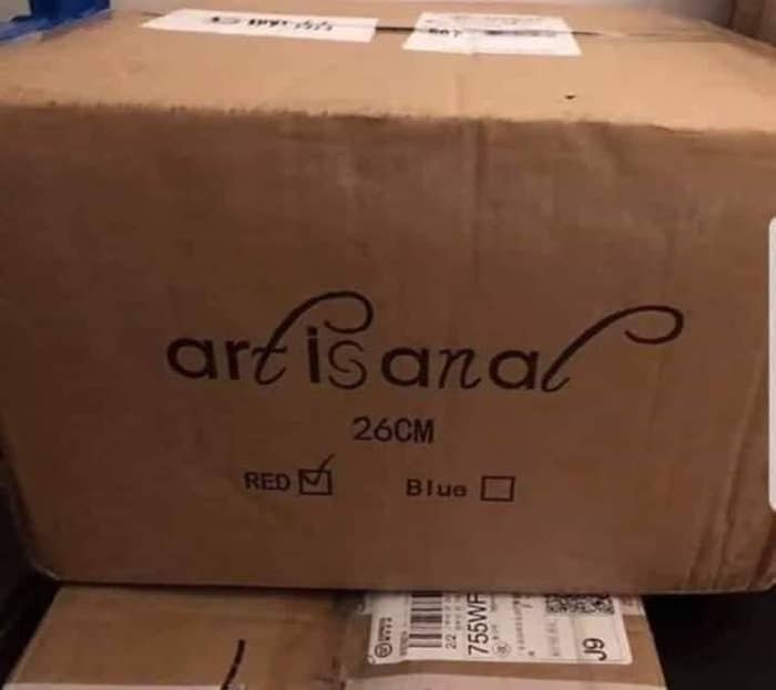
1.Actually, I'm pretty sure those are two different things.

A cardboard box labeled "artisanal," but the curvy T and L make it appear to read "art is anal"
u/ChunkyMandoo / Via reddit.com

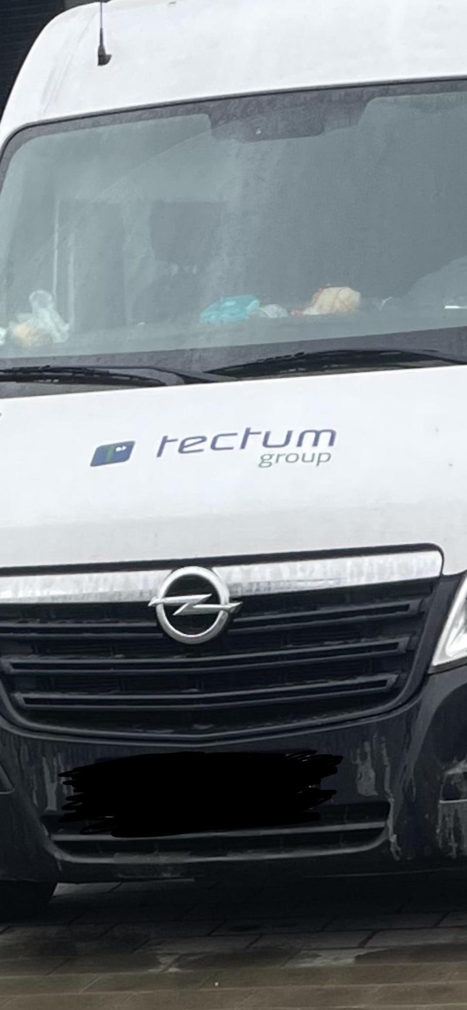
2.I'm honestly not sure how one would even do this.

An esurance billboard that appears to read, "cover your home in a dick" instead of "cover your home in a click"
u/YourGoldenMuse / Via reddit.com

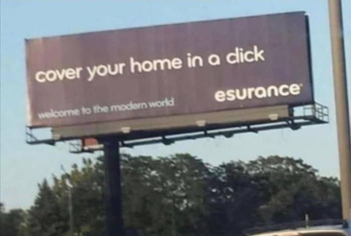
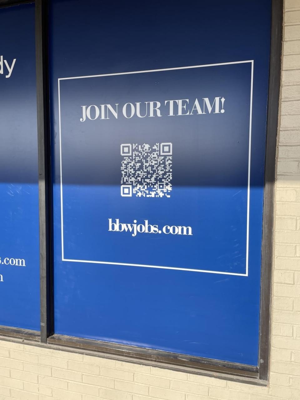
3.Good news, men. It's been located.

A wooden sign reading "Welcome to 'The Cut' Forest Recreation Area," but the u in "The cut" makes it look like it says "Welcome to 'The Clit'"
u/PsycoHenny / Via reddit.com

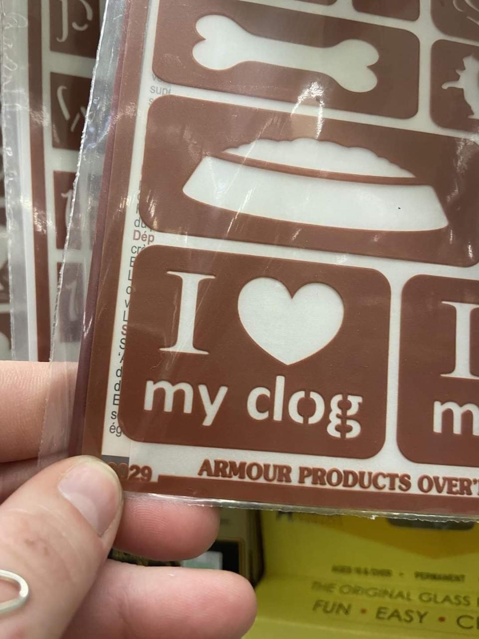
4.Who doesn't love a little hairball?

A person holding a stencil with the text "I ♥ my clog;" it's supposed to read "I ♥ my dog," but there's a space in the d
u/jonmpls / Via reddit.com

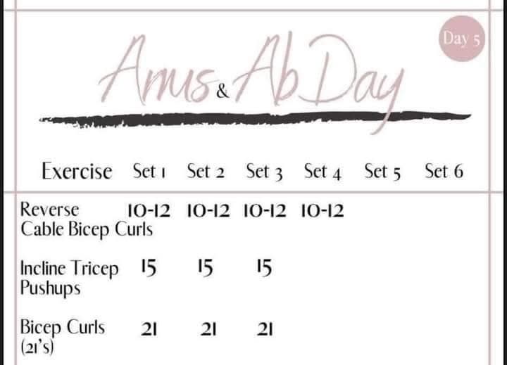
5.Some workout days are worth skipping.

A workout schedule titled "Arms & Ab Day," but the R and M in arms are too interconnected, making it appear to read "Anus & Abs Day"
u/This_Chaotic_Life / Via reddit.com

6. Just add a little larvae for crunch!

Twitter: @daveknapik

7.Is this a special club for proctologists?

A van with the logo "tectum group" is displayed on the front, but it appears to read "rectum group" because of the oddly shaped t's in this font
u/w0000mbat / Via reddit.com

8.I'm having a tough time swallowing this URL.

A blue sign with "Join our team!" and a QR code. The website bbwjobs.com is displayed at the bottom, but it looks like "blowjobs.com"
u/skankboy / Via reddit.com

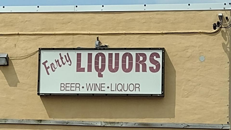
9.Beer, wine, and liquor, but they don't sell beans? Wild.

The sign reads: Forty Liquors, offering beer, wine, and liquor; the cursive "A" in Forty makes it appear that the shop is called "Farty Liquors"
u/Tonto_HdG / Via reddit.com

10.This takeout spot just needs a little lovin'.

The sign above a storefront reads "Pick Me Up," but from the angle of the photo, it's slightly blocked by an overhang and appears to read "Dick me up"
u/Ooogggeee / Via reddit.com

11. In case you want your home to smell like...uh...the salty sea air.

Twitter: @JaneWillmott

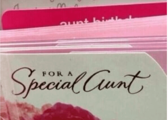
12.Absolutely no way she won't appreciate this card.

A greeting card display featuring a card with the text "For a Special Aunt," but the cursive A makes it appear to say "For a Special Cunt"
u/keith2301 / Via reddit.com

13. Personally I prefer to enter a restaurant thinking more about the food going in than coming out.

Twitter: @Scardina

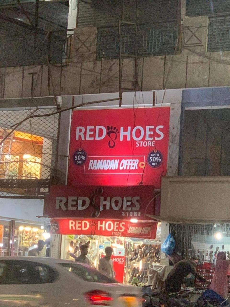
14.At least we know what color the er...*garden tools* are.

A storefront for "RedShoes Store," but their logo has the S displayed as a clipart foot so it appears to read "Red Hoes Store" instead
u/poisonbluetooth / Via reddit.com

15.I most certainly will not.

An outdoor sign that reads "Massage the rapist" with a decorative hand symbol at the top; there's some very unfortunate spacing going on (it's supposed to read Massage Therapist)
u/Lanky-Ad-8672 / Via reddit.com

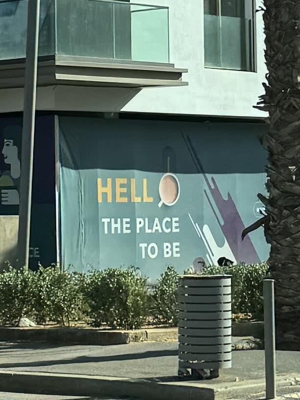
16.Satan's doing a little rebranding, it seems.

Text on a building reads "Hell the place to be," it intends to say "Hello" but they've used a coffee mug as the O and it really doesn't appear to be part of the actual text at all
u/f0r3v3r1 / Via reddit.com

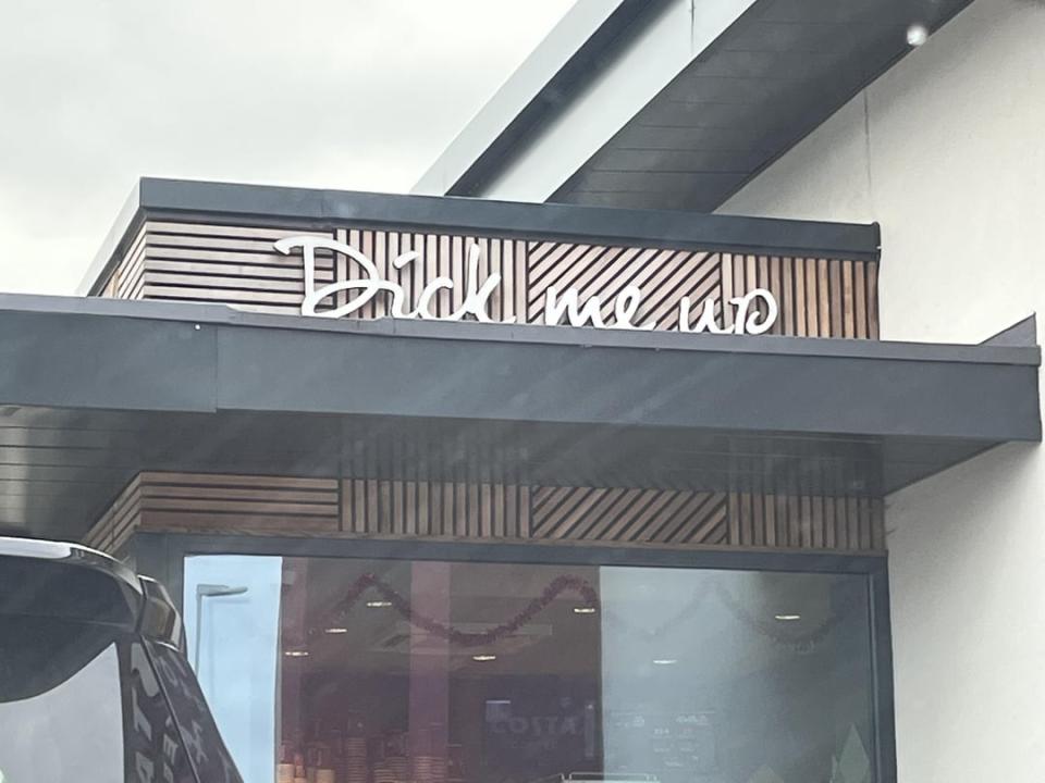
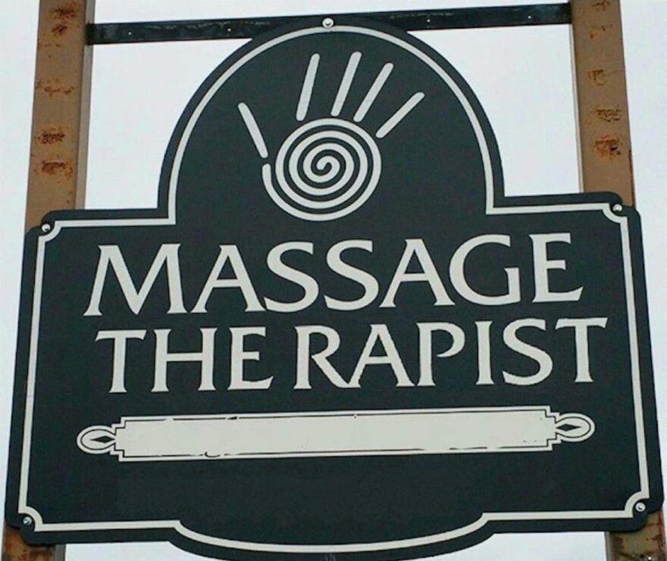
17. Please do not knock on my door asking for this.

Twitter: @itsPKav

Thank you to these kind folks for the healthy reminder to have someone look over your designs before putting them out in public!