"It's The New Version Of 'Carpet Over Wood Floors'": People Are Sharing The Commonplace But Low-Key Awful Features In Most New Or Renovated Homes
While the way we decorate our homes can (and should be!) up to personal preference, there's simply no way to escape the hotly-disputed "trends" that seem to be popping up more and more with each passing year. I was reminded of this when Redditor u/wazzel2u asked folks to shed light on the "terrible trends" found in new home design these days — and things got pretty heated in the comments. These are the hot takes that were too spicy not to share.
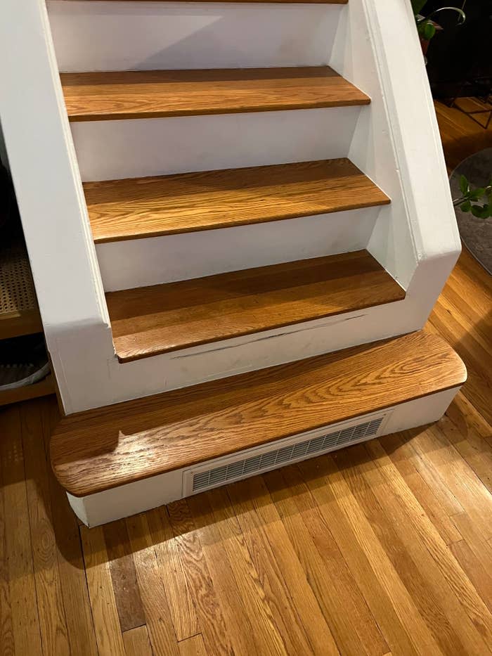
1."Removing stair banisters for a crisp look. Like, your drunk friend Brooks is going to fall off the side and die one day. There are building codes for a reason."
2."Open concept bathrooms. My dad has a huge bathroom that's open concept and has high ceilings. Like, the toilet is surrounded by nothing for a solid six to ten feet in all directions, except the one where it's backed against the wall. I don't know why, but there is some deeply buried primal instinct that comes out when I use that bathroom, I feel panicked. Like, my lizard brain is screaming, 'Don't poop out in the open, you're going to get eaten by a bear.' I hate it. It's unnatural."
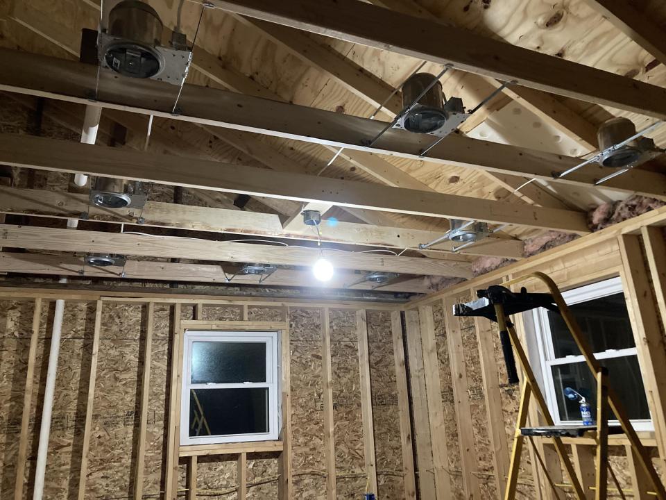
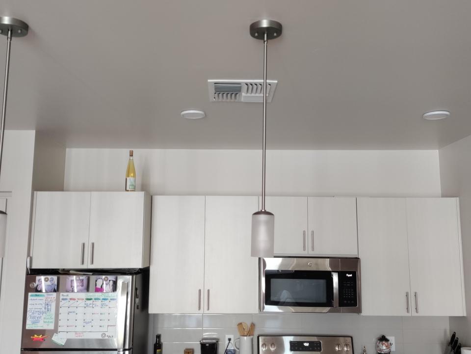
3."As an electrician, I see this all the time: putting 600 pot lights in every room of the house. Sure, it makes me money, but it looks fucking ridiculous having so many lights every four feet of every room."
4."Too many bathrooms. Every house they're building in my neighborhood is at least five-bed, five-bath. Who wants to clean that many bathrooms?! Having your kids share a bathroom teaches them to be considerate roommates when they grow up."
5."Agreeable gray. Everywhere."

6."Lack of storage space. I just bought a new home and didn’t realize how little space there was. We have one storage closet upstairs. That’s it."
7."No door between the main bedroom and main bathroom. It’s so annoying. The last three houses I’ve lived in have had this issue. I like to be able to close the door when I take a bath or shower."

8."Glass railings on stairs, or even decks. They get dirty really easily, and they're a big pain in the ass to install."
9."I've seen several homes with appliances integrated into the construction of the kitchen itself. Not just in an alcove but actually built into the wall. Sure, it's convenient that there's a cappuccino machine built into the wall. But what happens when — not if, when — it needs maintenance? Do I have to call a carpenter as well as a cappuccino machine repairman? Do I have to consider if this is a load-bearing wall that contains my broken appliance? It's one thing when it's just a convenience thing, but they do this with fridges, too."

10."Go to any high-end gated community development — $800k to $2 million in my area — and the front of the homes will be beautiful stone and brick. But on the back, every house has cheap ugly vinyl siding all the same color as far as the eye can see. I never understood this since you actually spend time in the backyard, not the front."
11."The 'modern farmhouse.'"

12."Floor-to-ceiling clear glass showers. They look great when they are spotlessly clean, which means it looks terrible most of the time in most homes."
13."Microwave 'vent hoods.' Building code should state that all new homes and apartments must actually take cooking fumes and misty oil, steam, heat, and CO and blow them outside. Who invented the microwave fan that sucks all the fumes up and blows them back out the top?"

14."Kitchens that they cram into a narrow rectangle as an afterthought. A lot of apartments and townhouses come with these. They are so narrow that if you open the fridge door, nobody can walk past you. A kitchen should be open, not walled on all sides, and shaped like a narrow rectangle. It drives me crazy when I see these."
15."Humongous kitchen islands. I'm only 5 feet tall, and I have to walk around the entire thing to get it clean. It's just too big to be convenient."

16."The trend of having big ass windows in the front of your home, so everyone in the street can see your whole ground floor. It turns your first floor into a fishbowl that I would never be comfortable in. I like to be able to walk around my house without worrying that the people across the street can track my every move."
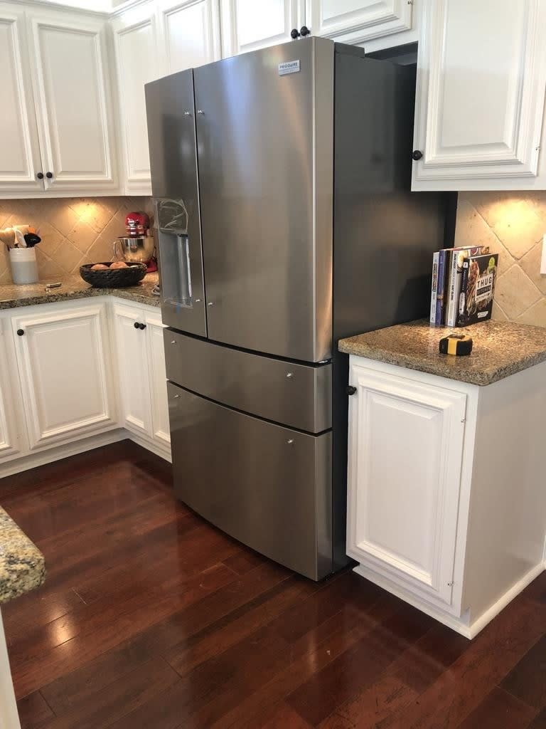
17."Counter-depth fridges. My family just recently remodeled their kitchen and got a fridge that was counter-depth. It fits nothing. It feels like a bachelor's fridge; it's meant to impress you when you first see it and then disappoint you the moment you're in the bedroom."
18."Most new sinks are absolutely terrible. Looking better is nice, but not at the expense of hitting your hand on the bowl every time you wash your hands."

19."Beating minimalism to death with a sledgehammer. Everything is gray and white with practically zero color anywhere."
20."It drives me crazy when people replace cabinetry with open shelves. Don't people understand dust? Do bugs ring a bell? Pet hair? Speaking of pets, how do you keep your cats from messing around with that setup?"

21."No broom closets. Where the hell do people put their mops and vacuum cleaners? Or do the people who buy those McMansions just not do any of their own cleaning?"
22."I really don’t like the fireplace design where you are intended to put your TV over it. A TV is way too high when over the fireplace."

23."Garages that fit two medium-sized cars with about one inch to spare."
24."Painting over bricks. It's the new 'putting carpet over nice hardwood floors.'"

25."Small laundry rooms, small pantries, and no closets...but here’s a 400-square-foot media room to watch TV. My next house will either be laid out by me or made in the '70s or '80s — back when they designed homes to be lived in."
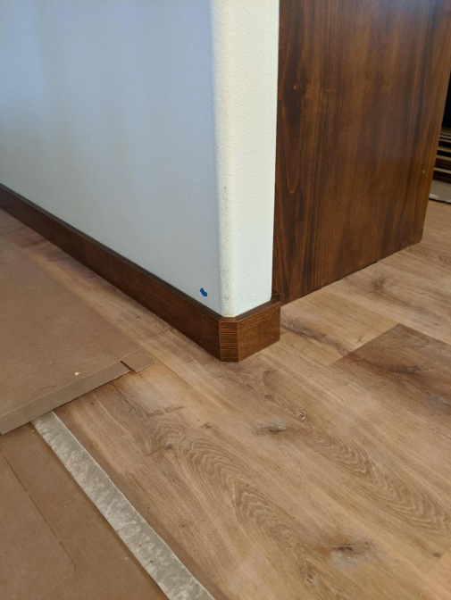
26."No trim on doors and windows. The drywall comes up to the door jamb, and it's squared off. It looks like a Greyhound bus station."

27."All white: white carpet, white furniture, and white shiplap."
28."Shitty bathtubs. I grew up in a 100-year-old house. It had a nice bathtub with a sloping back so you could comfortably lounge in the bath. Modern tubs are pretty nearly straight up on the back so there's no comfortable way to soak and read a book."

29."This might be an unpopular opinion, but I don't need my home to be smart. I just need things to happen when they are supposed to happen and not completely shut off when some idiot thinks it's a good idea to play 'who can touch the powerline.'"
30."Rounded corners. Sure, they look cool...until you want to paint your kitchen a different color from your living room."
31."I hate the design of homes that have a massive garage in the front: 'Welcome to my garage! The house is in the back.'"
32."Exposed 'wood beams' in houses that have typical white drywall ceilings and walls. It’s atrocious, and I think it’s going to look really dated in 20 years."

33."Wasted space. This includes enormous bedrooms with sitting areas, homes with an equal number of beds and bathrooms, extravagant foyers that eat half the front of a house, and formal living or dining rooms that never get used."
34."Weird fixation perhaps, but I cannot stand kitchen cupboards that don't go all the way up to the ceiling. No cabinet storage and a big gap on top for my husband to pile all kinds of crap on top of. No thanks!"
35."Giant homes on tiny lots with two feet of grass around them. There were two homes in my old neighborhood that were actually capable of hitting each other's windows."
36."Open floor plans where the main floor is just one big room."

37."These days, the exteriors seem to be designed by a committee of people who can't work together. Every possible exterior finish is on there: faux stone, stucco, siding at all angles, board and batten, shingles and shakes...you name it, some part of the house has it, often in disparate colors. It looks very bad."
38.And finally: "Those dumb, fake balconies."

What's a modern home or interior design trend that you absolutely cannot stand seeing — or dealing with on a regular basis? Let us know in the comments below, or through this anonymous form.
Note: Submissions have been edited for length and/or clarity.

 Yahoo Lifestyle
