
 Yahoo Lifestyle
 48 Dumb, Misleading, Or Inappropriate Designs That Businesses Clearly Did Not Think Through At All
1.This kids coloring book drawing that accidentally makes this woman look...curvier:

2.This hand sanitizer bottle that's bound to cause a very thirsty person to make a big mistake:

3.This sign that I'm guessing you had no idea was for a ski lift:

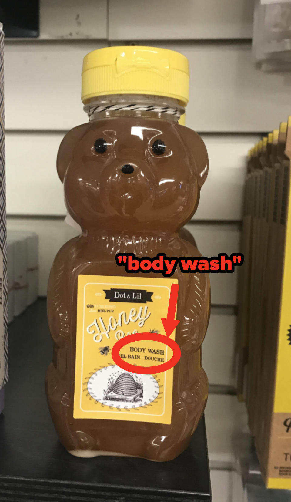
4.This packaging for body wash that anyone would mistake for honey:
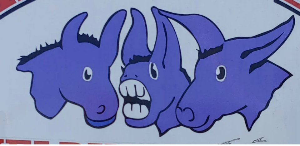
5.This logo that's for DEROTIC Emergency Equipment and not whatever else you thought it was:

6.These abstract, confusing bathroom signs:

7.This cheese wrapper that makes it look all gross and moldy:

8.This tissue box that imagines if Spider-Man could shoot webs from places besides his hands:

9.This doormat where the letter "M" is virtually invisible:

10.This pool float that looks like a menstrual pad:

11.This mug design that tried to make a "W" double as a "V":

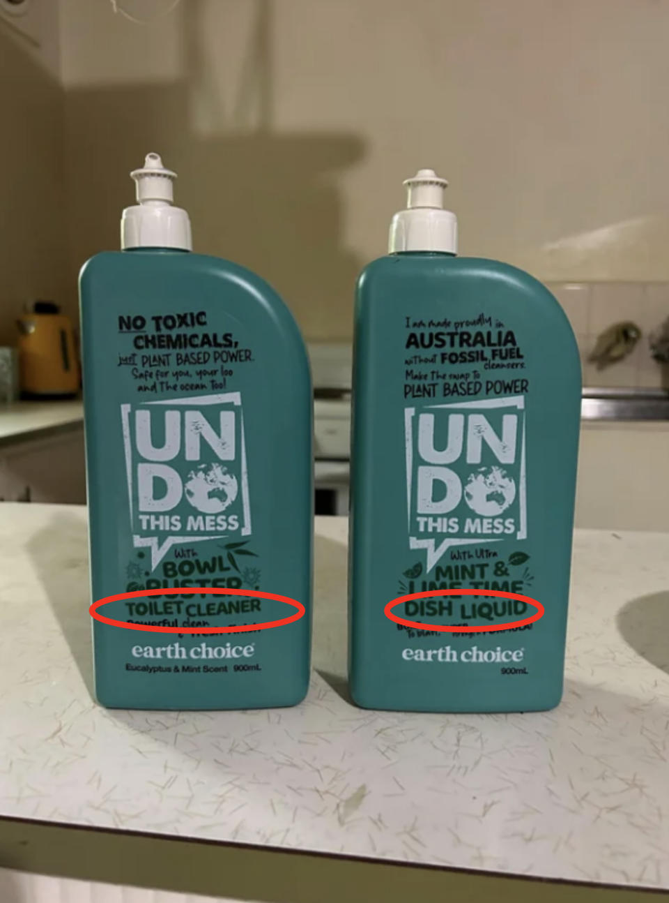
12.These nearly identical bottles for toilet cleaner and dish liquid:
13.This logo with haunting animation:
14.This door art that makes using the door handle suggestive:

15.These restroom tiles that would make me walk out immediately:

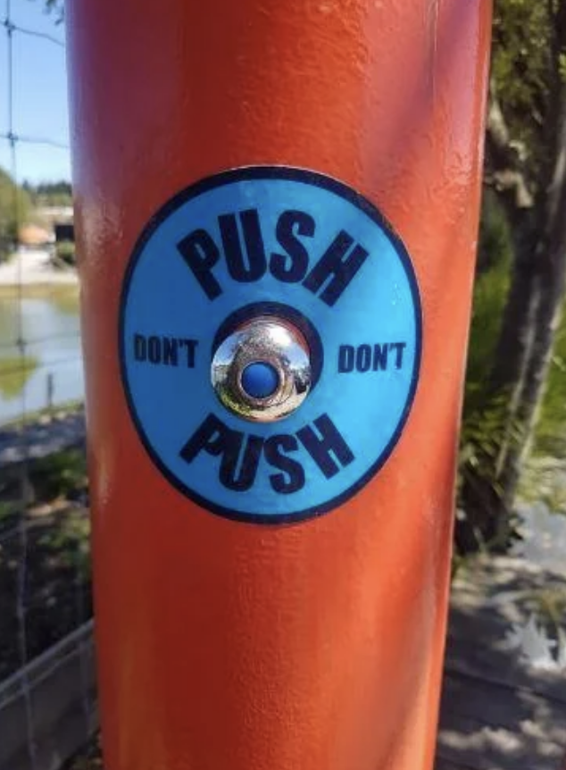
16.This confusing warning sign:
17.This business center's logo that looks like someone sitting on the toilet:

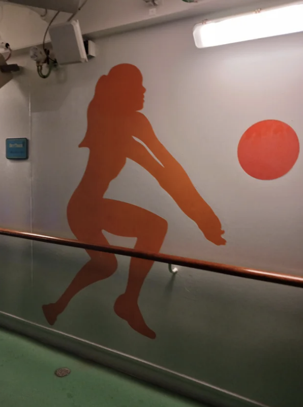
18.This design of a woman with cartoonishly long arms:
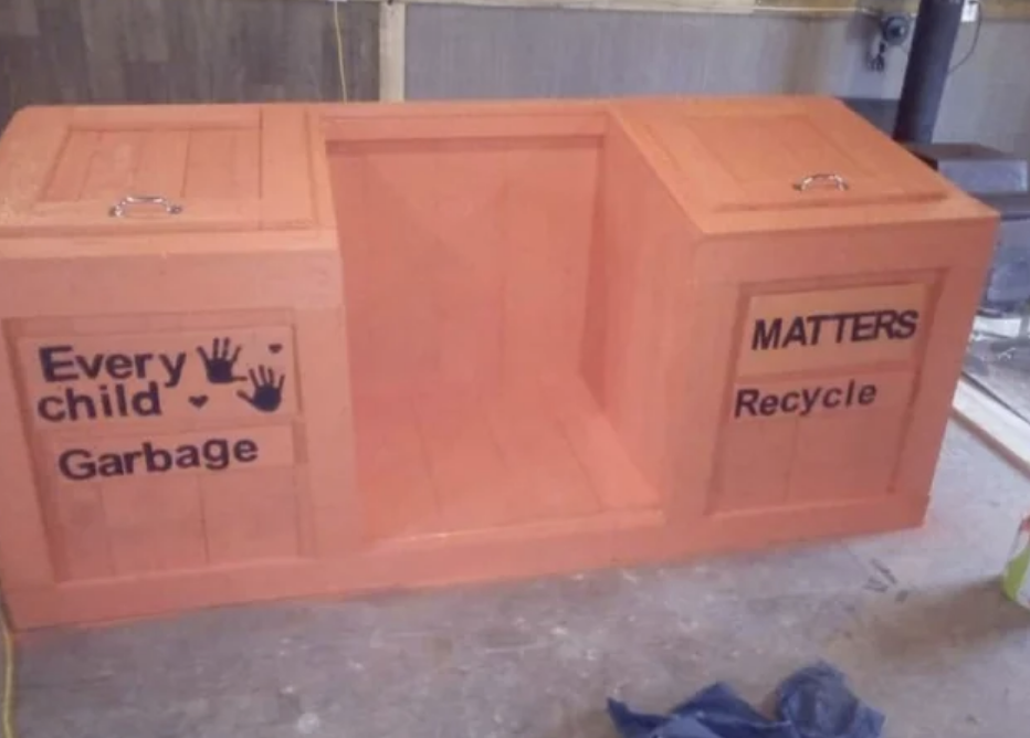
19.This design that...wasn't thought through:

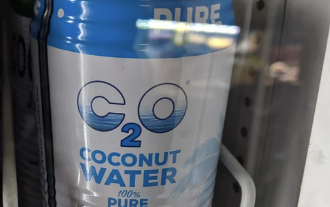
20.This logo for coconut water that's actually the chemical equation for dicarbon monoxide:
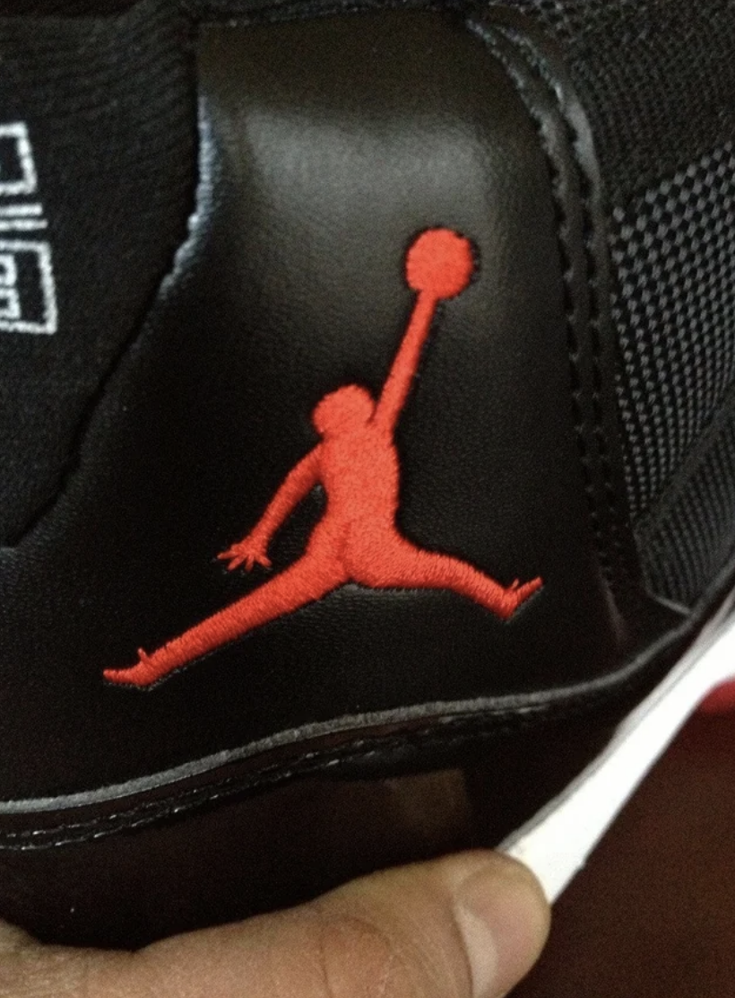
21.This very detailed logo on knockoff sneakers:
22.These duplicate elevator buttons where one set is only supposed to be used for emergency:

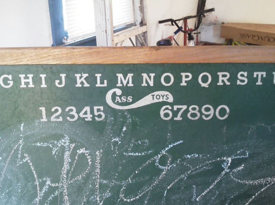
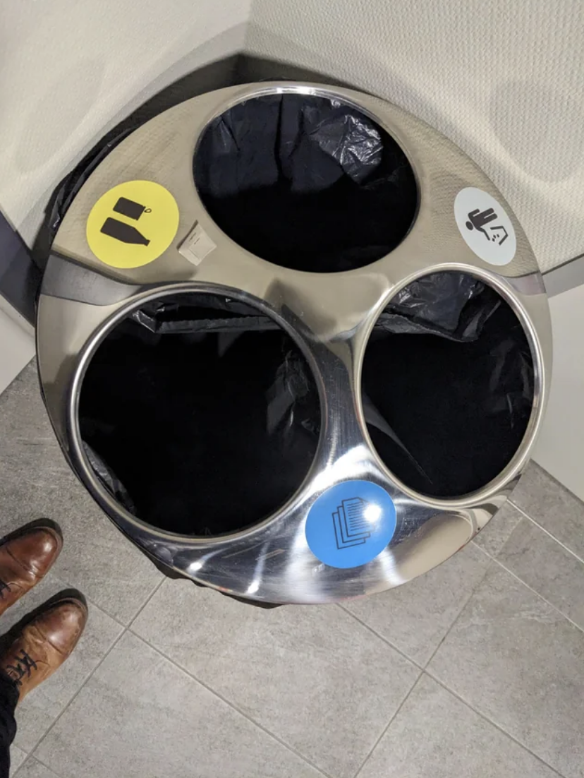
23.This logo for kids toys that looks like a swear word:
24.These trash can labels that make sorting the trash confusing:
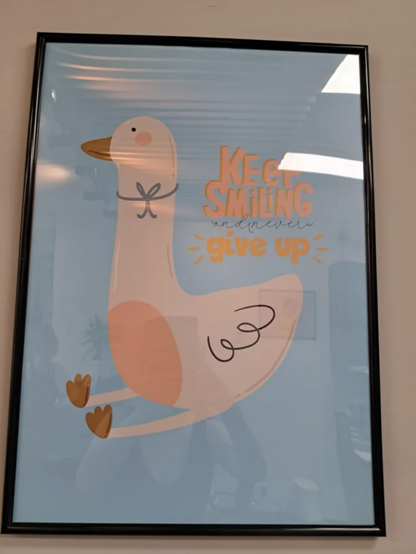
25.This unsuccessful motivational poster in a doctor's office:
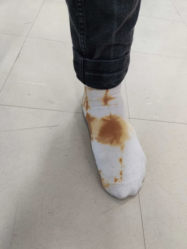
26.These crappy tie-dye socks:
27.The message on this sign that should've been ordered differently:
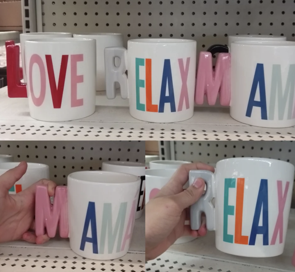
28.These mug handles that are nearly impossible to keep a steady grip on:
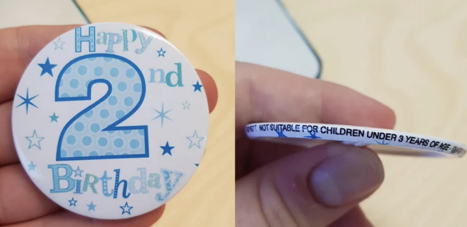
29.This button for 2-year-olds that's so small it's a choking hazard for anyone under three:
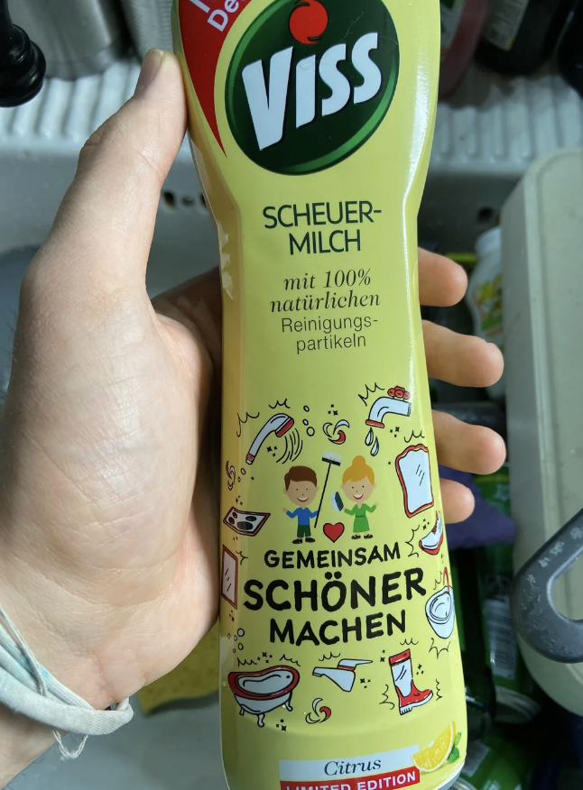
30.This not-safe-for-kids cleaning product that has child-friendly packaging:
31.This hotel key card that can't fit in a wallet:

32.This hotel room carpet with a design that makes the carpet look worn out:

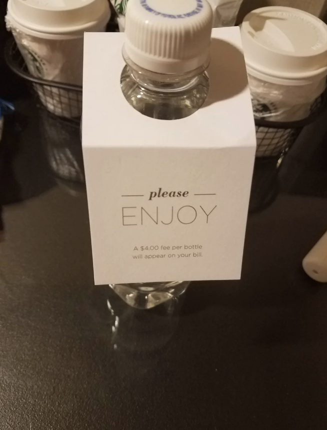
33.This hotel water bottle that SEEMS complimentary because they made the fine print so small:
34.This decorative sign that actually says "eat":

35.This hideous, unreadable daycare center sign:

36.This traffic sign that looks like it's telling people to follow others home:


37.This sign with directions that couldn't have been executed any worse:

38.This logo that makes reading "bunch of grapes" much harder than it had to be:

39.This sign that reads like it insults certain employees:

40.This double-sided exit sign:

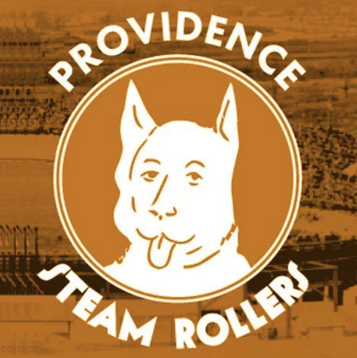
41.This bathroom sign that desperately needs some rewording or punctuation:

42.This logo that looks like a dog-human hybrid:
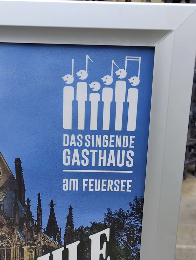
43.This sign that says "cook"...allegedly:

44.This logo for a singing tavern that looks like people being killed:
45.This AI-created logo that was not checked for spelling:


46.This stop sign that reads more like a "stup" sign:

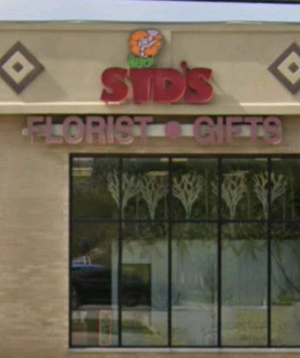
47.This logo that actually says "Sid's" but you wouldn't think that at first glance:
48.And lastly, this sign that needs to be WAY bigger so people could see it before they make a MASSIVE error:


