
 Yahoo Lifestyle
7 reasons it’s time to ditch your iPhone


We get offered a lot of phones to trial here at Yahoo Lifestyle Australia. And up until now, I’ve never felt the need to test out any of them.
Having used an iPhone for the past 11 years, there’s never been any real reason for me to switch to another brand, and I feared having to wrap my brain around a whole new interface, so I just never bothered.
Until now. I’ve been using my iPhone 8 Plus for a couple of years, and it’s a great phone and I’ve enjoyed it. But I know that next time I upgrade, I’m going to have to learn how to use the phone without a Home button. And sure, it won’t be a big deal, and it’s probably the kind of adjustment that will take approximately two minutes to make and then I’ll forget there was ever any other way to use a phone.
But the knowledge that there I was already facing any kind of learning curve whatsoever was enough to make me take up Samsung’s invitation to try out their new premium offering, the Galaxy Note 10+. Because if I have to use a new interface anyway, why not go the whole hog and switch brands entirely?
Now, after playing around with the Note 10+ for a few weeks, I genuinely don’t think I’ll ever go back to an Apple phone.
Here are seven reasons why:
It’s simple to use
The Galaxy UX is, by and large, intuitive and straightforward. I haven’t had to bend my brain to understand how it all works together. And it could be because I’ve come fresh to the Samsung operating system, but every time I learn a new shortcut, it triggers a minor dopamine release. Finding the back button was a game-changer. Discovering the pull-down menu on the home screen was practically an epiphany. How fun!
The shape is smart, and possibly feminist
Having used an iPhone Plus for the past several years, it’s a relief for my short fingers to be able to reach across the entire screen when operating it one-handed, thanks to the large, but narrow profile. Thank you Samsung for recognising that not everyone has big hands – or in other words, that women make up 50 per cent of the potential customer base.
The camera is next level
In the same way that iPhones have Portrait Mode, which gives that professional-looking blurred background, Samsung phones have a camera setting called ‘Live Focus’. But where your iPhone is limited to blurring the background in standard shots, Live Focus is also available in selfie mode – and for shooting video. That means you can get that nice ‘bokeh’ effect in every single camera mode, not to mention there are different styles of bokeh, like circular light patterns for the background at night.
The ability to draw glasses and moustaches on your friends and colleagues in real time is pretty fun too, but I probably wouldn’t call that a deal breaker if you’re on the fence about buying one of these.
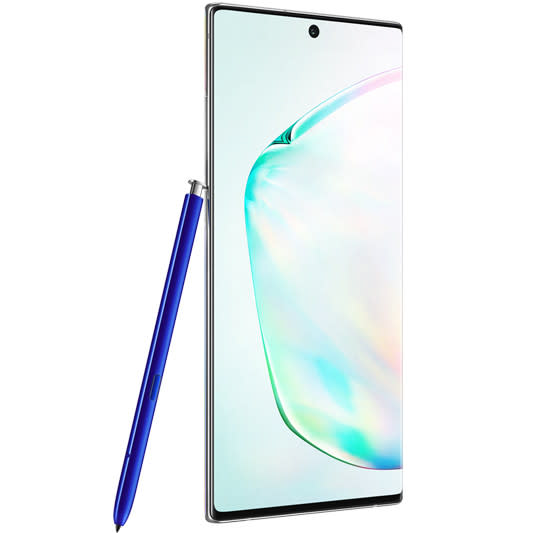
The stylus is genuinely handy
It’s no gimmick. Ok, I’m not sure why you’d ever need to use air gestures with the stylus as a remote control for your phone, since phones are typically… handheld, however there are other use cases that make the built-in stylus a worthwhile inclusion. Such as, the Note 10+ stylus works as a remote control for the camera, so if you’re taking a selfie you don’t have to awkwardly hold the phone to try to stretch your thumb around to the button. Sometimes it’s the little things.
It’s time to embrace the new
As I mentioned earlier, if you’re using the iPhone 8 onwards, you’ve either already adapted to a new, home-button-free UX or you’re going to have to do so once you next upgrade. So you might as well dive right in and give another maker a burl, given you’re learning your way around a new UX anyway. Which leads us straight into…
It plays nicely with other brands
One of my chief anxieties around switching away from the iPhone was the thought of having to introduce a new brand into my digital ecosystem. I’ve been using Apple products for so long that I was nervous about how any other phone would hook up to my laptop/iPad/iMessages, etcetera. Guess what: it’s a non-issue. Incorporating this phone into my life has been pretty well seamless, since it’s not trapped inside a closed ecosystem in the way Apple products are. If anything, I’ve now expanded the possibilities for personal connectivity. It charges via a standard USB-Type C cable, for one. And as for iMessage? Well, I’ve been spending a lot more time on WhatsApp.
It’s gorgeous.
Yes, this is shallow, but you know what? Good design matters, and the Note 10+ brings me happiness every time I pick it up, because the back of the phone is powered by rainbows – it’s holographic! Holla at my fellow late Gen X/early Millennials, that nostalgic feeling you’re experiencing is a callback to primary-school sticker albums. And that’s not even to mention the way the front glass curves all the way over the sides, like the phone equivalent of an infinity pool.

And two reasons to stop and think about it
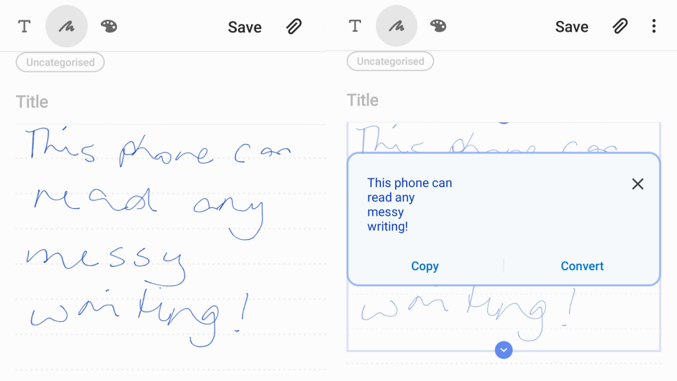
The note function isn’t perfect
I’ve raved previously about Samsung’s Galaxy Tab Notes functionality, which is a true class leader. Unfortunately I’m not as wowed by this function on a much smaller phone, using a much smaller stylus. While it’s equally successful at translating my scrawled, barely legible notes, ultimately it feels a little fiddly and awkward to write using such a small pen, and the narrow width of the screen means that when you convert your notes into text, they tend to end up looking like a shopping list because nearly every word is on a new line.
The calendar is kind of annoying
It’s possible there’s a trick to this and I just haven’t figured it out, but if so, that simply means this isn’t an intuitutive interface. The calendar shows either teeny tiny little boxes or giant, full screen days and you can’t simply scroll from one month through to the next the way you can on an iPhone – if you try to scroll, it just concertinas the entire calendar down.
Got a story tip or just want to get in touch? Email us at lifestyle.tips@verizonmedia.com
Want more lifestyle and celebrity news? Follow Yahoo Lifestyle on Facebook, Twitter and Instagram.
Or sign up to our daily newsletter here.

